

NYC Personal Branding Photography: Portraits, Press & Content Days
Planning NYC personal-branding photographs for your website, press or next launch? Start with the people and placements the images need to reach. Explore NYC portrait sessions or ask about your portrait session.
Personal branding photographs should help someone understand who you are and how you want to introduce your work. For an NYC creative, that might mean an About-page portrait, a press photograph or a wider collection for a website refresh. Start with where each photograph will live.
These portfolio examples show visual possibilities; they don’t imply that everyone pictured is a founder or commissioned a branding campaign. Explore my NYC portrait photography for a broader look at the work.

Decide what the photographs need to do
Open the pages or materials you’re updating before building a mood board. A small biography photograph needs a readable expression. A banner may need a wider frame with room for a headline. An interview can benefit from context. One crop may not solve all three.
A founder introducing a business might need an About-page portrait and press image before a full content library. A creative refreshing an established website may already have a good close portrait but lack wider photographs. These are planning examples, not fixed packages.
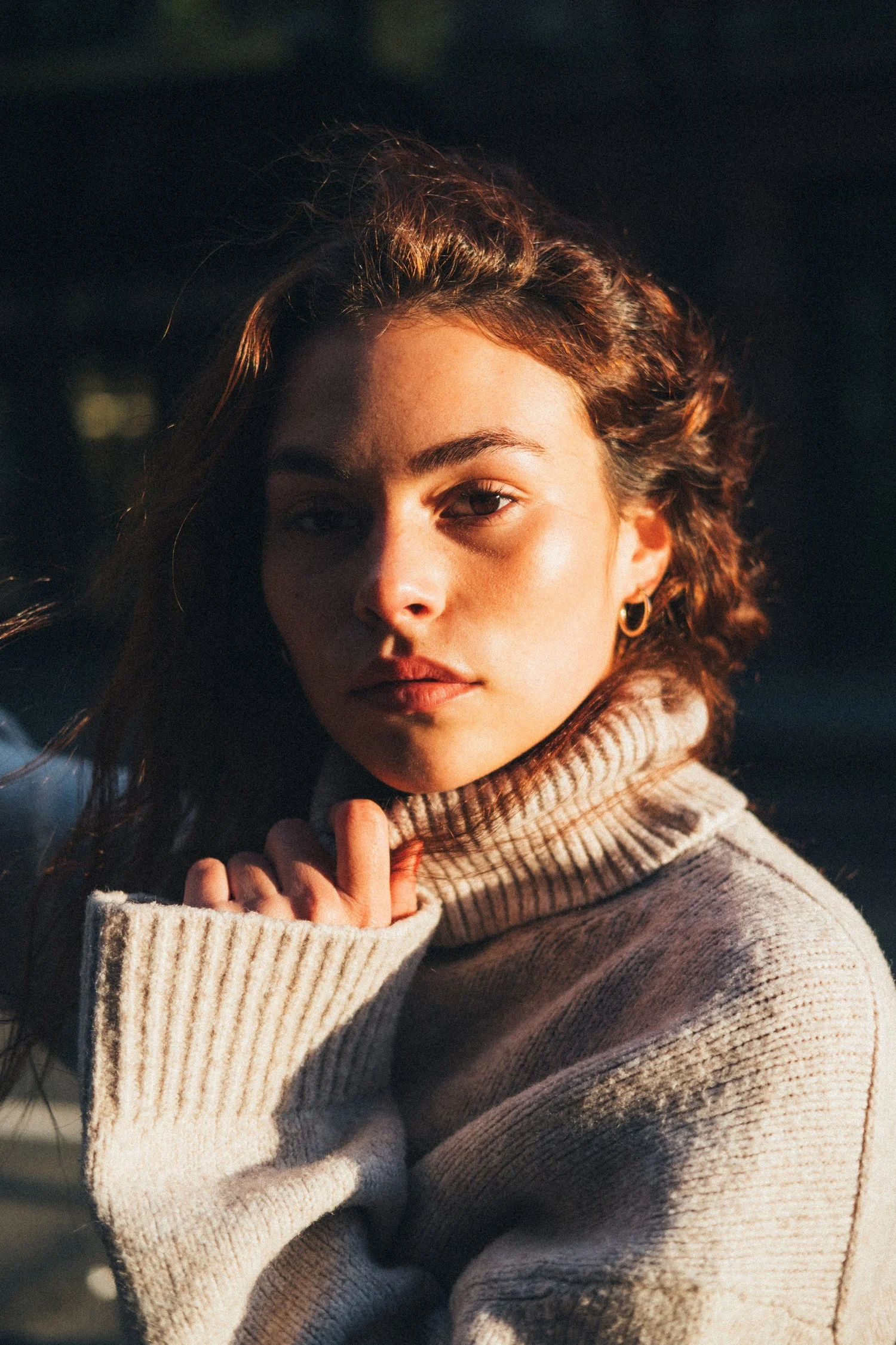
A focused portrait session or a content day?
A focused portrait session suits a clear introduction with a few different expressions or compositions. The attention stays on you: how you sit or stand, how the light falls and what the photograph communicates.
A broader content day starts with several uses that need different photographs: perhaps introductory portraits, environmental images and relevant working details. More outfits and locations help when they serve those uses. For a broader project, send me the priority placements, people involved, location ideas, and deadline so we can discuss a tailored photography scope. Video, styling, studio hire, additional production, and specific deliverables need a separate conversation; the examples here are planning possibilities, not an included package list.

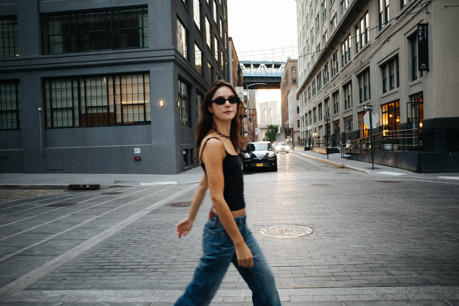
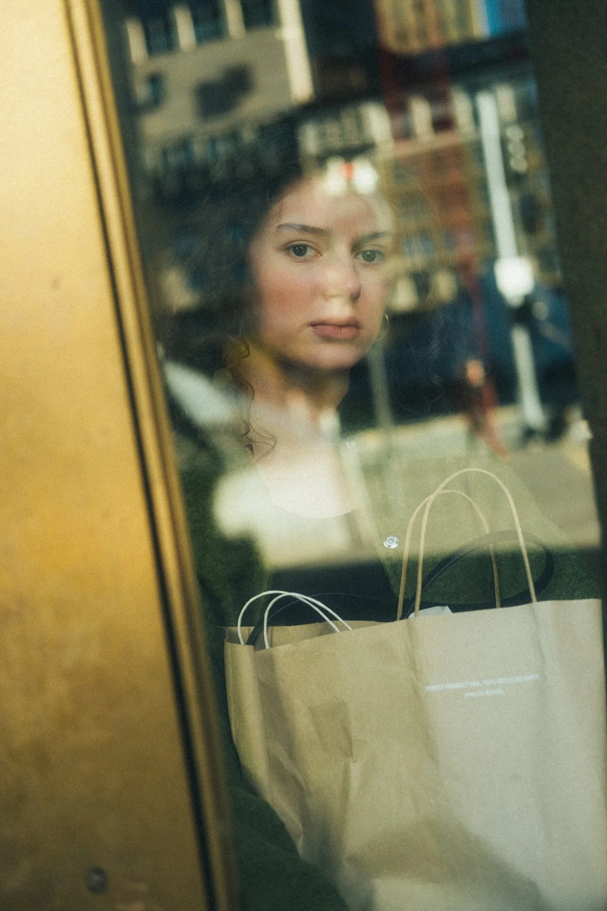
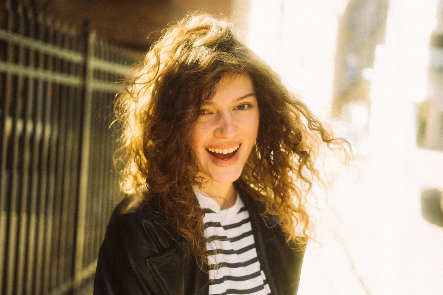
Consider how the collection fits together. Amanda’s walking portrait gives the city a larger role, while a close portrait offers a more concentrated introduction. That variation can be useful across different pages.
Make a simple asset plan
This table is a starting point for your brief, not a standard deliverable list. Bring screenshots and mark the priorities.
| Use | Photograph to consider | Brief detail |
|---|---|---|
| About page | A clear introductory portrait | Layout and display size |
| Press or speaker biography | A direct portrait and contextual alternative | Requested crops and credits |
| Website banner | A wider frame with usable space | Desktop and mobile headline positions |
| Project updates | Distinct gestures or settings | Actual stories you plan to share |
| Your process | An authentic environment or working detail | Access and private material to exclude |
Choose the must-have image first, then supporting photographs that add something. Two placements may share one good image; different messages or shapes may need separate compositions.
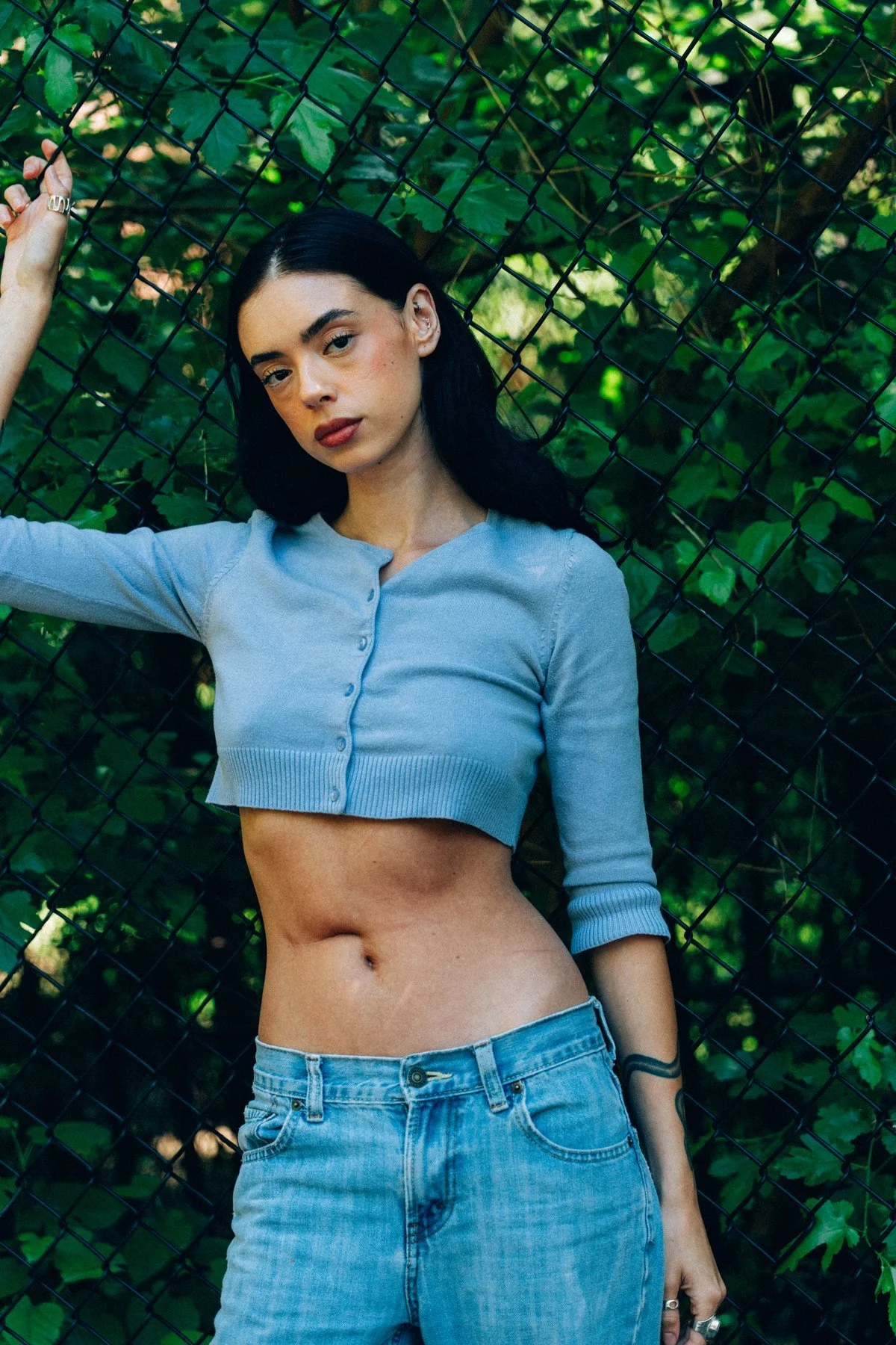
Choose a direction that feels like you
Translate words such as “creative” or “professional” into choices we can see: clean backgrounds, strong color, softer light, close framing or movement. A few references with explanations are more useful than a large collection of unrelated pictures.
Wardrobe and setting can reinforce each other. Eden’s ivory dress separates her from the warm room. Bring clothes you feel comfortable moving in, and consider their relationship to the setting. The portrait wardrobe guide can help narrow the choices.
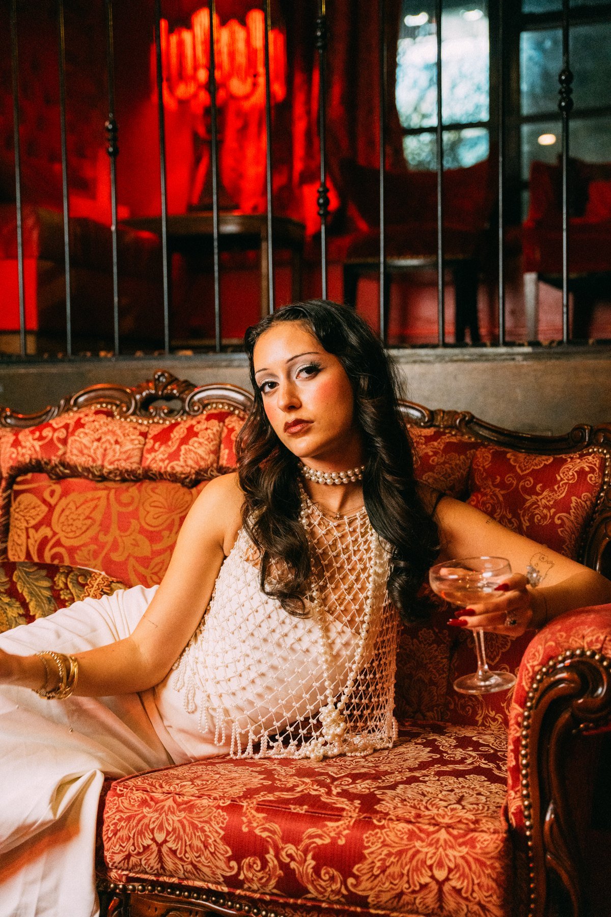
Let the setting contribute something true
A location can provide atmosphere without pretending to be your workplace. If you want to show your process, choose surroundings and objects connected to it. For an expressive portrait, we can focus on light and texture without assigning a fictional story.
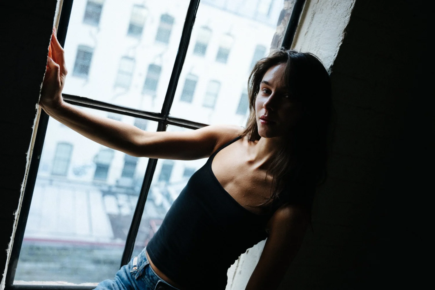
In New York, a compact route makes the session easier to manage. Discuss interior access, changing arrangements and priority outdoor settings. A window, a street and a seated composition can provide variety without a tour of landmarks.
Vary scale, posture and expression
A useful collection needs more than a change of jacket. Rose’s full-length seated photograph gives styling and posture space, while Amanda’s window portrait makes architecture more prominent.
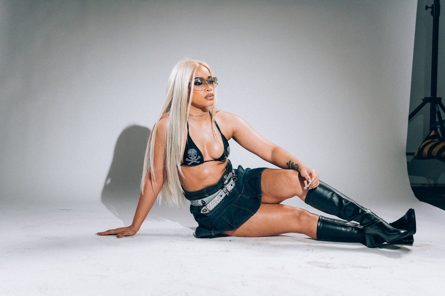
You don’t need every gesture rehearsed. Knowing which expressions feel like you helps, while leaving room for the session to develop. My guide to looking natural in photographs covers ways to feel more at ease.
Select against the original plan
Does the main portrait work at its intended size? Is there room for the website crop? Do supporting images add another expression or scale? A shared feeling can make the collection coherent without identical compositions.
Gather placements, references, timing and access needs in your photography brief. After the session, the guide to choosing final portraits can help shape a considered introduction to your work.
Plan your NYC personal-branding session
Share your work or website, where the photographs will appear, your preferred dates and a few references that feel like you. Tell me whether you need a focused introduction or a broader image library; we can shape the session around that purpose.
Ask about your portrait session · Explore NYC portrait sessions
Continue planning with planning a broader brand content day.