
NYC Editorial Portrait Ideas: Style, Movement & Setting
Ten photographs from my work, with ideas you can borrow: texture, gesture, movement, and a setting that gives you room to play.
A textured sweater, a raised arm, a stairwell, a moving skirt: small choices can change the whole feeling of an editorial portrait. These photographs from my work show how to turn those details into ideas for your own NYC session.
Start with the feeling of the photographs
An editorial portrait session gives us room to consider the whole frame: styling, gesture, light, and surroundings. For me, the interesting part is how those choices work together. The photographs can feel connected while still giving each image something different to do.
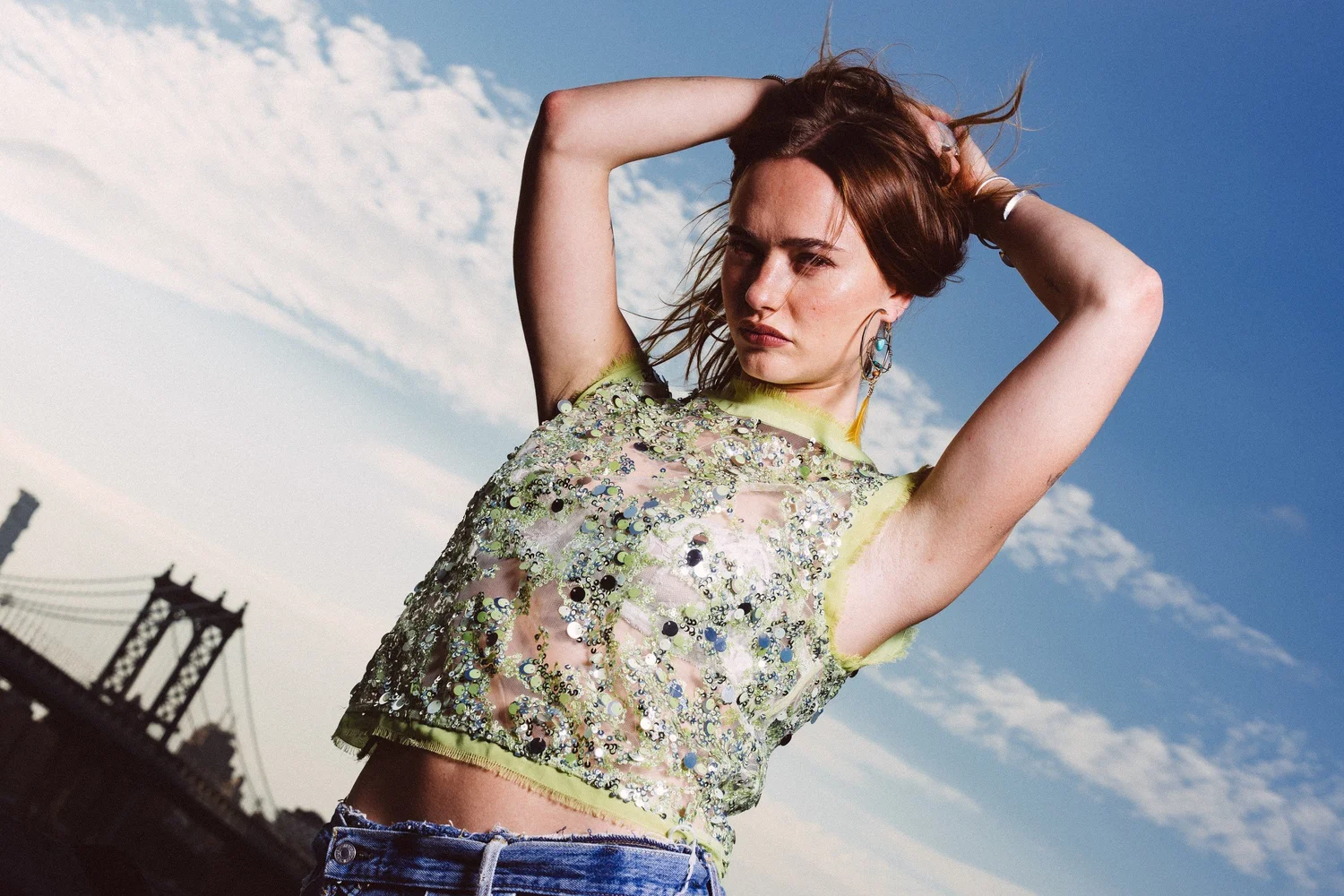
In Johnny's opening portrait, the lifted arms make a shape around her head. The pale green top catches the light, and the low viewpoint gives the sky more space. You can describe what makes the frame work without needing a complicated story around it.
If you're planning NYC editorial portraits, choose a few qualities you want to explore. They might be playful movement, strong shapes, textured clothes, or a quieter atmosphere. These ten photographs from my work offer practical starting points for that conversation.
Let the clothes contribute texture and shape
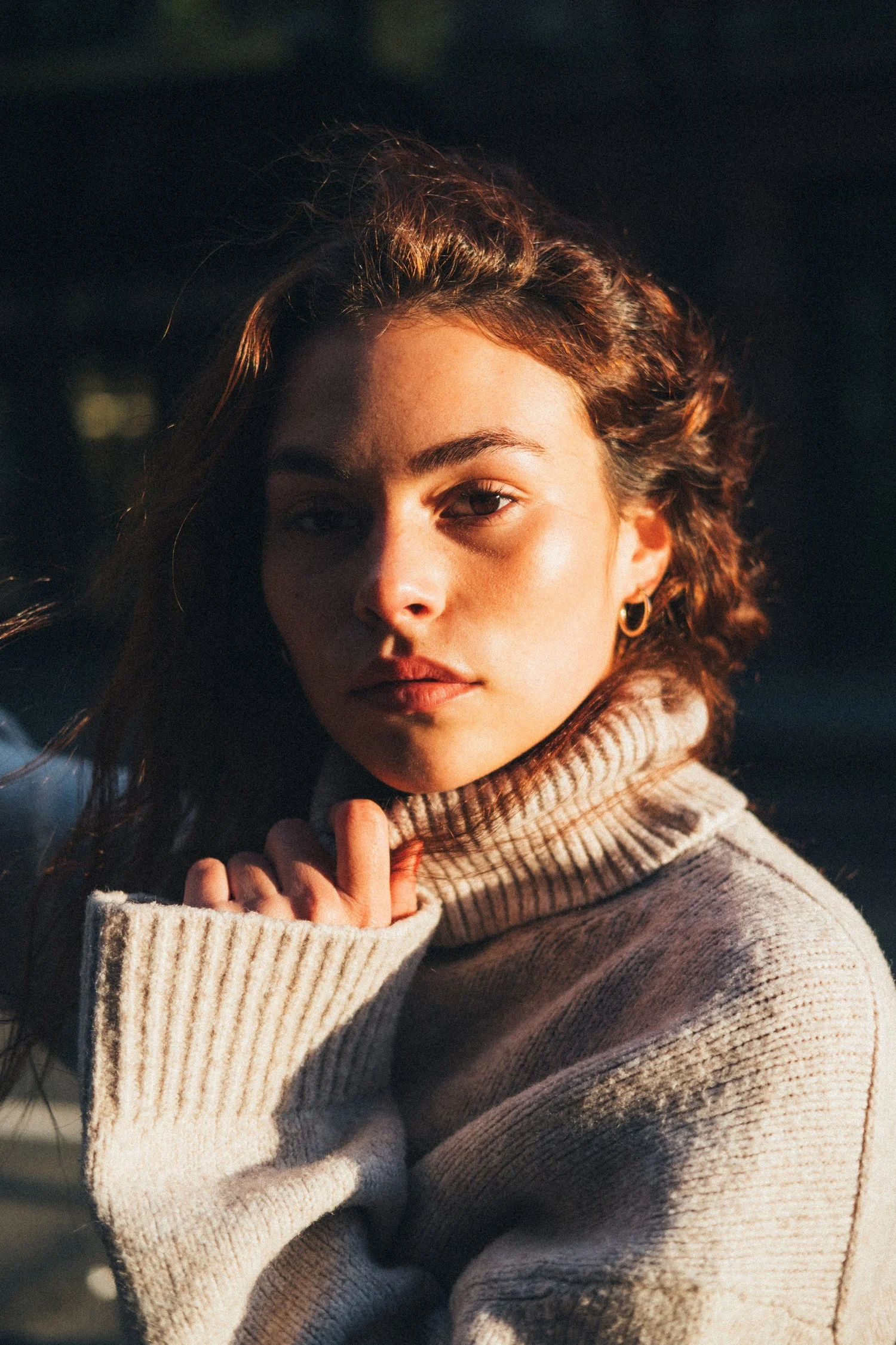
Marley's cream sweater works at two distances. Close up, the ribbed collar and sleeve give her hand something to interact with. The light across her face creates a clear point of attention. The outfit feels tactile because the photograph gives the knit room to be seen.
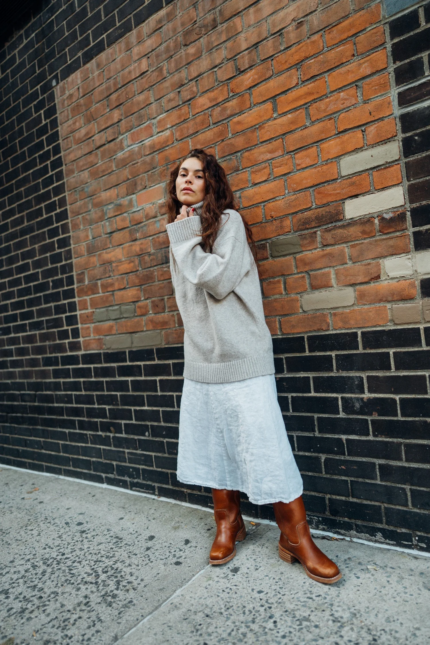
The wider portrait introduces the skirt, boots, and brick wall. Now the outfit reads as a complete silhouette. The pale fabric stands apart from the darker lower bricks, while the boot color sits comfortably beside the warmer masonry.
When choosing clothes, consider more than whether you like them in a mirror. Can you sit, reach, and walk comfortably? Does the fabric have a texture or shape you want to show? One useful outfit can create more variety than several looks that all behave the same way.
Build a gesture, then change its context
Johnny's red-dress portrait repeats the idea of raised arms, but it produces a different photograph from the opening frame. The tighter view gives the pattern more presence, while the rooftop and buildings become softer context around her.

A starting gesture is useful because it gives us somewhere to begin. From there, a small change in the angle of the elbow, the direction of the eyes, or the position of a hand can change the balance. There is no need to hold one elaborate pose until it feels stiff.
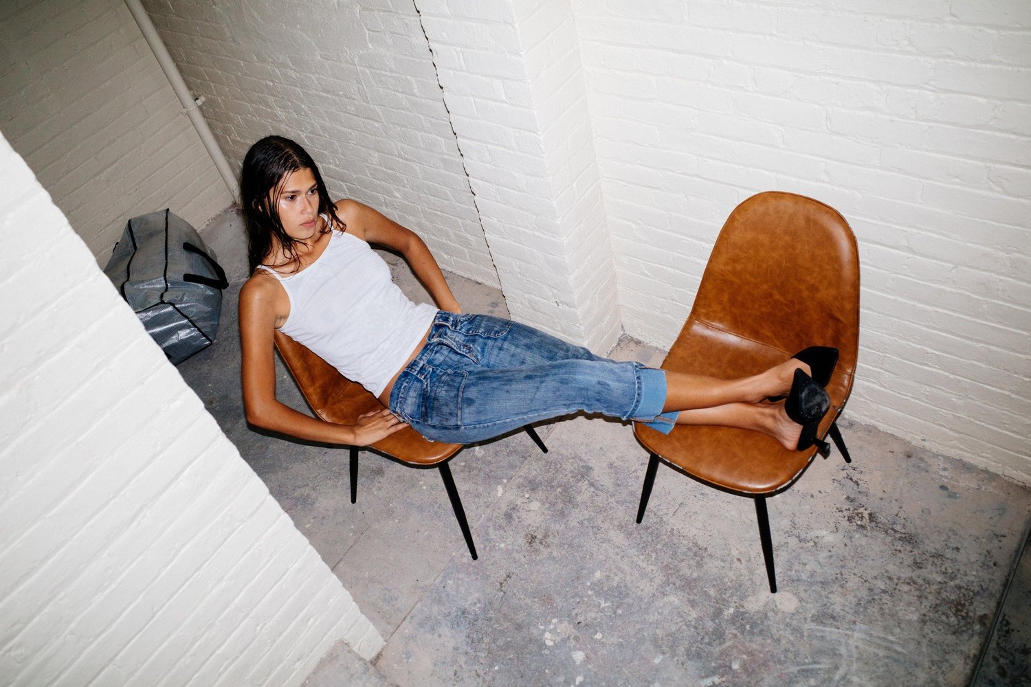
Tara's portrait uses a different kind of shape. The two chairs extend her body across the frame, with her legs forming a long line between them. The high viewpoint makes the arrangement easy to read against the pale room.
The practical lesson is to notice the direction a pose creates. Upright, diagonal, and horizontal shapes bring different rhythms to an edit. An editorial sequence benefits from having more than one.
Choose a setting that gives you something to work with
In Amanda's interior portrait, the railing and window divide the frame into clear areas. The white brick adds texture, and her dark top gives her body an outline against it. The setting is doing several useful things at once.
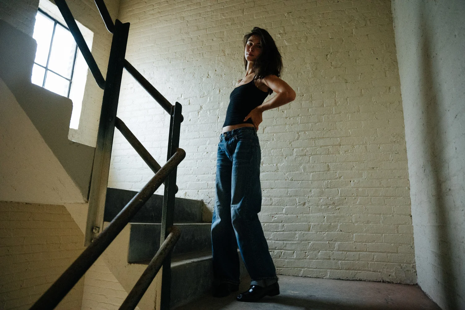
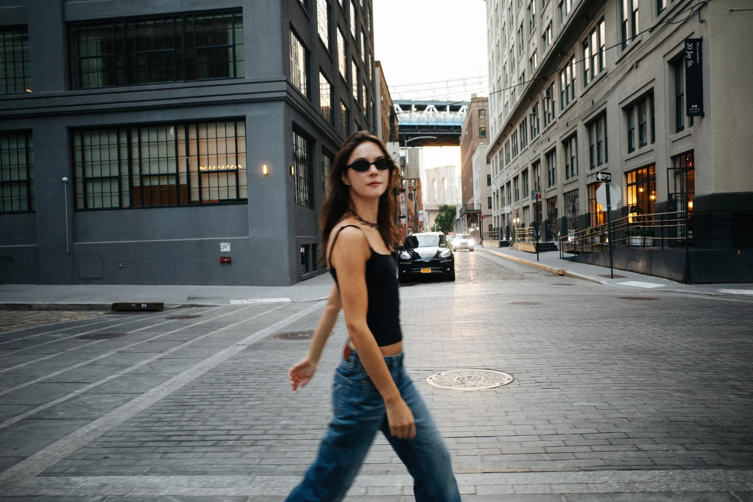
The street photograph has a different structure. Buildings recede behind Amanda, while her body crosses that depth. Sunglasses, a walking gesture, and the city setting give the image a more outward-looking energy.
For your own shoot, a location should offer useful light and places to move. A window, a simple wall, or a stretch of street can be enough when the proportions work. My NYC street photography guide takes a closer look at how backgrounds and framing influence a portrait.
Use movement to change the pace
Marley's extended arm and lifted skirt make the cobbled-street portrait feel open. The clothes and gesture move away from the center of her body, giving the frame a different rhythm from a close, contained portrait.
Hannahbeth's photograph handles energy differently. Her crossed arms create a compact shape, while the background becomes streaked and soft. The contrast between that shape and the surrounding blur is what makes the picture interesting.
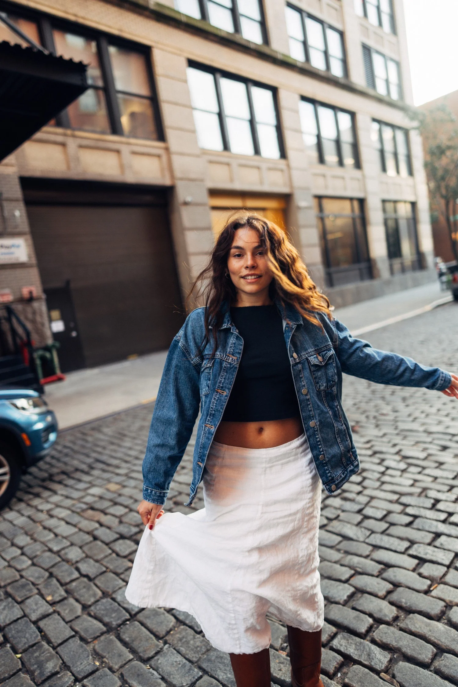
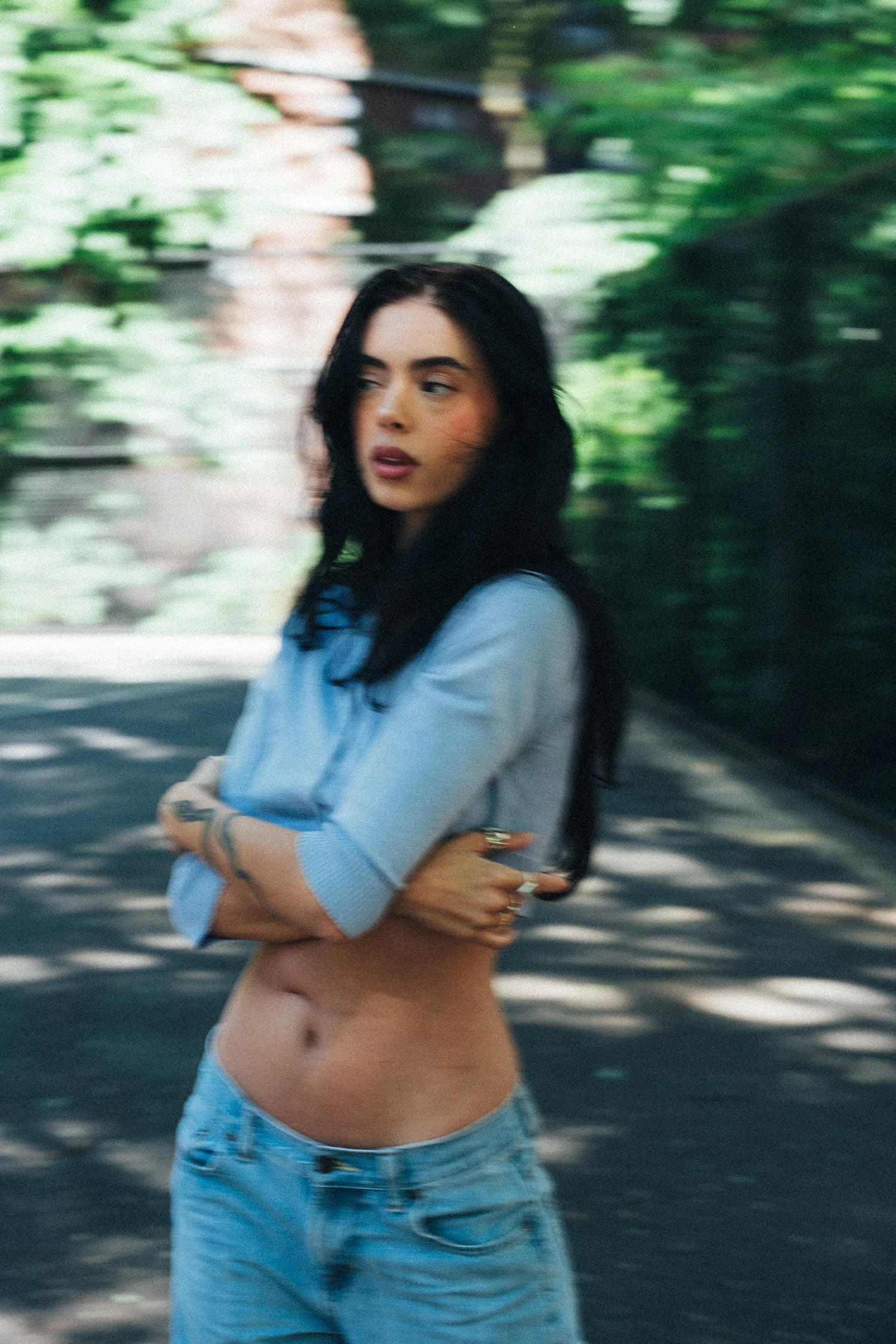
Movement does not have to mean jumping or making every frame dramatic. Walking, turning, adjusting a sleeve, or shifting your weight can produce useful changes. Some photographs will be clear and settled; others may keep traces of motion. The strongest edit can make room for both when each adds something.
Include a quiet frame in the sequence
Tara's window portrait provides a pause after the more active photographs. Her profile, the angle of her wrist, and her fingertips against the frame are small details. The darker interior lets the window become the main area of light.
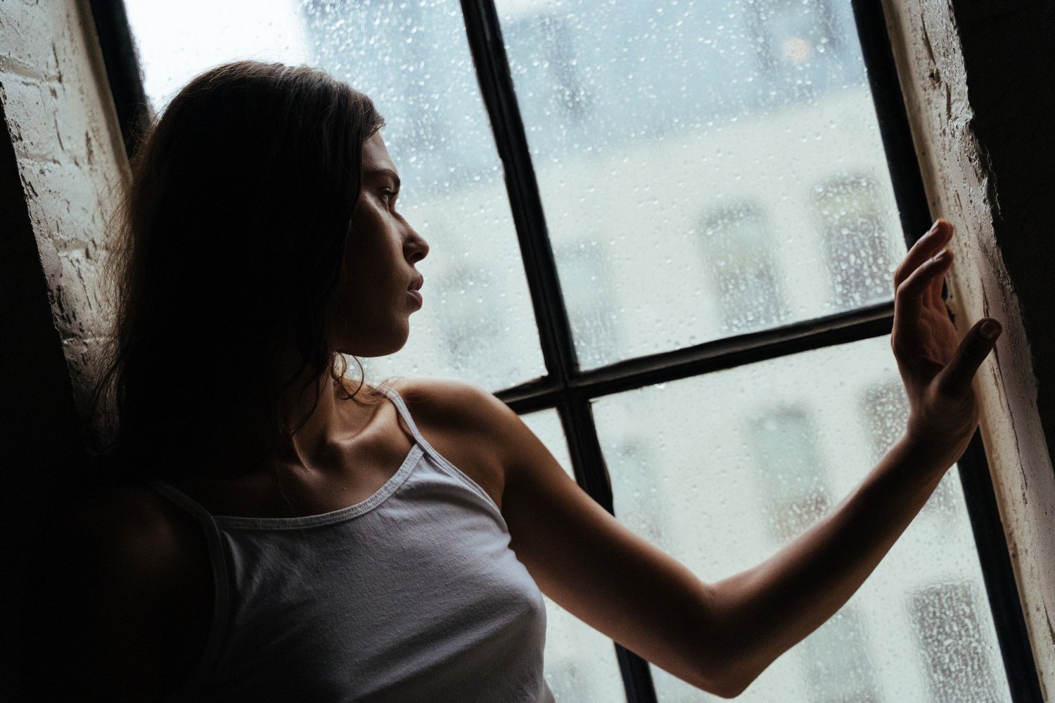
I look for this kind of variation when photographs will be shown together. A close view can follow a wide one; a calm gesture can follow movement. The sequence feels more deliberate when each photograph changes the pace without losing its connection to the others.
My guide to choosing final portrait photos explains how to make those decisions. If tone and shape are your main interest, explore the black-and-white portrait guide as well.
Plan your NYC editorial portrait session
Send a small starting brief:
- Two or three references: note the clothes, light, expression, or framing you like.
- Where the photographs will appear: a portfolio, profile, press feature, or personal print.
- One outfit and setting idea: include any access you can confirm.
You do not need to copy a finished photograph. These choices give us somewhere to begin.
We can discuss outfits, accessible settings, and the range of images you want. You do not need a finished mood board or a modeling background to begin. Start with a feeling and a purpose for the photographs, and we can develop the session from there.